Charting the Economy
Timely economic data curated by research staff at the Federal Reserve Bank of Kansas City. Click the link button in the chart title to copy and share.
Profits’ Contribution to Inflation in 2023 Remained within Historical Range for Pre-Pandemic Recoveries

Note: The blue shaded region shows the range of contributions to inflation from corporate profits seen in the four quarters before and 13 quarters after the beginning of pre-pandemic recoveries.
Sources: U.S. Bureau of Economic Analysis and authors’ calculations.
Profits of nonfinancial corporate firms made an atypically high contribution to inflation early in the COVID-19 recovery (orange line), rising outside the historical range for recoveries (blue shaded region). However, since 2021:Q2, the contribution from corporate profits has been within a range consistent with pre-pandemic recoveries. This pattern reflects firms raising prices in anticipation of higher costs in 2021, and higher costs being realized in 2022 and 2023, as argued in Glover, Mustre-del-Río, and Nichols (2023).
Corporate Profits Contributed a Lot to Inflation in 2021 but Little in 2022—A Pattern Seen in Past Economic Recoveries
Andrew Glover, José Mustre-del-Río and Jalen Nichols
Corporate profits contributed a similar amount to inflation during the pandemic recovery as in past recoveries.
Sales Listings of Existing Single-Family Homes Are Rising

Notes: Gray shading depicts National Bureau of Economic Research (NBER)-defined recession. Data extend through February 2024.
Sources: National Association of Realtors and Redfin (both accessed via Haver Analytics).
The number of homeowners newly listing their home for sale each month has been moving up steadily since July 2023 (blue line), following its sharp move downward during the preceding two years. Similarly, the total number of existing single-family homes listed for sale, both newly listed and previously listed, has been moving up steadily since August (green line), reaching its highest level in more than three years in February 2024. The increase in new listings is boosting sales of existing single-family homes, including large increases in January and February (not shown).
Charting the Economy Data and Trends Housing MacroeconomicsCommunity Banks Provide Critical Financial Services across the Nation
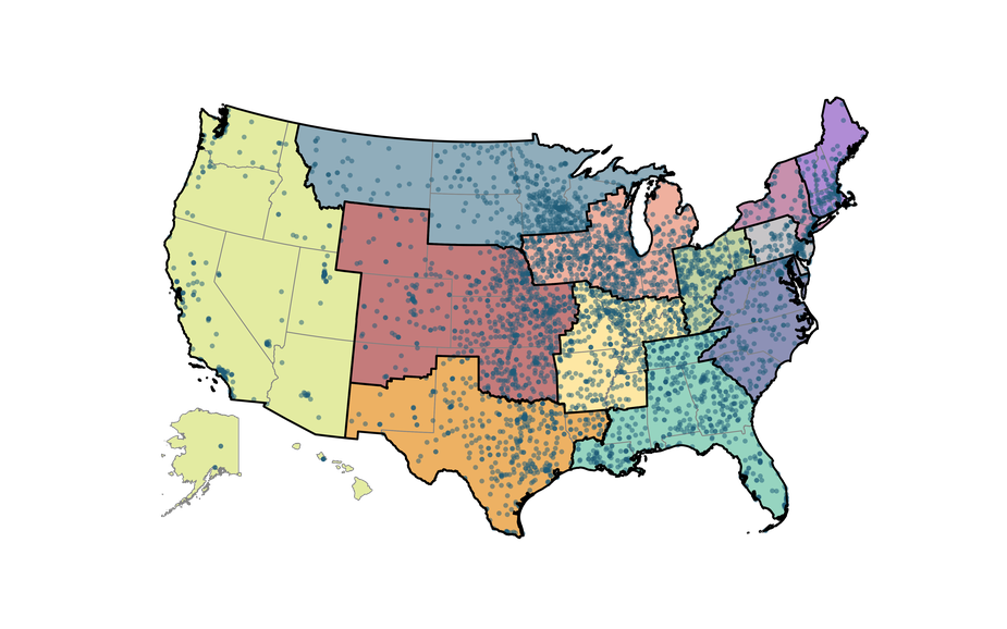
Notes: Each dot denotes the headquarters of a community bank or thrift, defined as a depository institution with total consolidated organization assets of less than $10 billion. Colored regions denote the geographic boundaries of each of the 12 Federal Reserve Districts.
Sources: FFIEC, National Information Center, and Federal Reserve Bank of Kansas City.
Community banks, often defined as banks with less than $10 billion in assets, are integral to the U.S. financial system due to their nationwide presence. Additionally, these smaller banks are usually headquartered within their markets, and many community bankers engage in civic activities. For these reasons, community banks help make up the fabric of their communities. Perhaps most importantly, community banks play an outsized role in many rural or otherwise underserved areas. In fact, the Midwest has a large share of community banks, and nearly 700 are in the Kansas City Fed’s Tenth District (red area).
Charting the Economy Banking and Finance Economic Geography RegionalLabor Markets in Interest-Rate-Insensitive Industries Appear to Be Responding to Monetary Policy Tightening
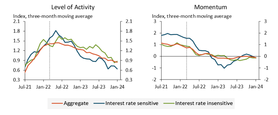
Notes: All series have a mean of zero over the period January 1992 through January 2024. The y-axis unit is standard deviations of the aggregate LMCI series. The dashed vertical line denotes the start of monetary policy tightening in March 2022. Information on series construction and sources for model input data can be found in the data appendix of Dilts Stedman and Pollard (2023).
Sources: Dilts Stedman and Pollard (2023) and authors’ calculations.
Dilts Stedman and Pollard’s (2023) industry-level versions of the Kansas City Fed’s Labor Market Conditions Indicators (LMCI) provide evidence that labor markets in interest-rate-insensitive industries were slower to respond to monetary policy tightening during the first year of the current tightening cycle, in line with historical trends. However, labor markets in these industries now show signs of cooling, with the level of activity (a measure of labor market tightness) trending downward since June 2023. In addition, labor market momentum in interest-rate-insensitive industries turned negative in March 2023, even falling below interest-rate-sensitive momentum during the second half of 2023, a sign of softening labor market conditions.
Kansas City Fed's LMCI
The Kansas City Fed Labor Market Conditions Indicators (LMCI) are two monthly measures of labor market conditions based on 24...
Labor Market Tightness, Though Elevated, Is Not Far above Pre-Pandemic Levels
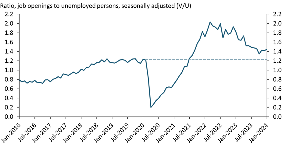
Note: Data series extends through January 2024.
Sources: U.S. Bureau of Labor Statistics (Haver Analytics) and authors’ calculations.
zipDownload the data file for this chart. (Updated through February 2024)
A closely monitored measure of labor market tightness is the ratio of job openings to unemployed persons, or the V/U ratio. As shown in the chart, after rising sharply during the pandemic, the V/U ratio has declined considerably from its peak in early 2022. Currently, the V/U ratio has been oscillating around 1.4 (implying 1.4 job openings per unemployed worker), above but not far from its pre-pandemic level of 1.2 (represented by the dashed line).
Charting the Economy Data and Trends Labor and Demographics MacroeconomicsU.S. Oil Production Has Had a Remarkable Record of Consistently Beating Expectations
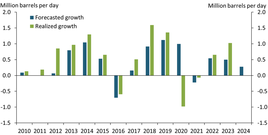
Notes: Chart presents change in average annual U.S. oil production. Forecasts are based on each year’s January Short-Term Energy Outlook (STEO). Realized growth is not yet available for 2024.
Sources: U.S. Energy Information Administration and authors’ calculations.
Over the past 14 years, U.S. oil production growth (green bars) has consistently outpaced expectations (blue bars), driven by both price and productivity surprises. U.S. oil output hit all-time highs following strong growth that exceeded expectations in the 2010s and a rapid recovery in production post-pandemic. However, recent industry trends appear to be shifting. With reduced drilling activity and a move toward industry consolidation, we may see a more measured approach to expansion, likely leading to a more predictable, though cautious, future growth trajectory.
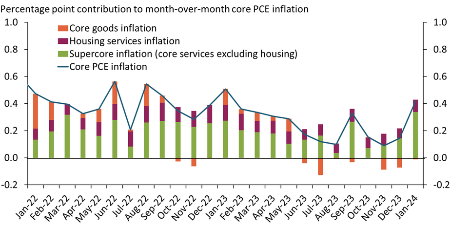
Charting the Economy Data and Trends Energy Natural Resources and EnvironmentSupercore PCE Inflation Surged in January to Its Highest Monthly Level in More than Two Years
Sources: U.S. Bureau of Economic Analysis (Haver Analytics) and authors’ calculations.
zipDownload the data file for this chart. (Updated through February 2024.)
Supercore prices—the prices of core services excluding housing—as measured by the Personal Consumption Expenditure (PCE) price index jumped by 0.6 percent from December 2023 to January 2024, the largest monthly increase in more than two years. As supercore expenditures account for more than half the weight of the PCE core bundle, the contribution from the surge in supercore inflation (green bars) drove monthly core PCE inflation up to its highest level since January 2023.
Charting the Economy Data and Trends Inflation Supercore InflationSingle-Family Home Permits Moved Up for the 12th Consecutive Month in January
Notes: Gray shading depicts National Bureau of Economic Research (NBER)-defined recession. Data series extends through January 2024.
Sources: U.S. Census Bureau (Haver Analytics) and NBER.
Single-family home permits moved up for the 12th consecutive month in January 2024, cumulatively increasing 36 percent from a trough one year earlier. The number of single-family home permits in January—1.02 million at an annual rate—was modestly above its level just prior to the pandemic in February 2020 but well below its average during 2021. With home prices at a historic high, single-family home construction is likely to continue to move up throughout 2024.
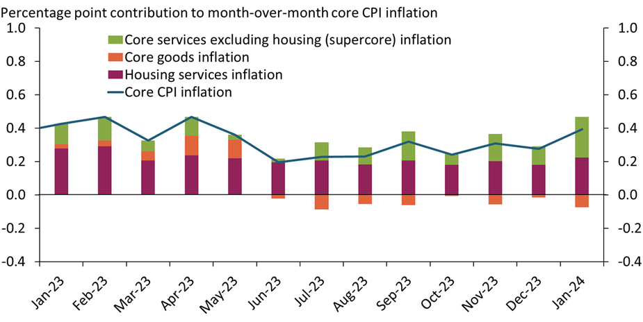
Charting the Economy Housing Data and Trends MacroeconomicsSupercore Inflation Jumped in January, Suggesting Continuing Inflation Pressures
Sources: U.S. Bureau of Labor Statistics (Haver Analytics) and authors’ calculations.
zipDownload the data file for this chart. (Updated February 2024.)
Inflation from core services excluding housing—or “supercore” inflation—increased in January, contributing 0.24 percentage points to core Consumer Price Index (CPI) inflation, up from 0.11 percentage points in December (green bars). Of the three primary components of core CPI inflation—core goods, housing services, and supercore—supercore inflation is the most labor intensive and therefore especially sensitive to nominal wage increases. Although nominal wage increases moderated during 2023, they remain above their pre-pandemic levels, continuing to put upward pressure on supercore inflation.
Note: This chart replaces an earlier version to correct the calculation of supercore inflation.
Charting the Economy Inflation Data and Trends Supercore InflationKC Fed's LMCI Suggests the Pre-Pandemic Relationship between Labor Market Variables Has Been Restored
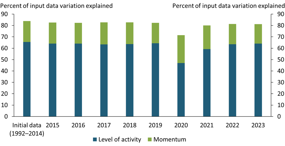
Notes: Chart shows how much of the variance in the LMCI input data is explained by the level of activity and how much by the momentum series. As a baseline, we calculate the explained variance from 1992 to 2014, the period used for the LMCI’s first release. We then add each subsequent year of data to this baseline dataset separately and re-calculate the explained variance. For instance, to calculate the explained variance for 2023, we use data from January 1992 to December 2014 and January 2023 to December 2023, omitting the years in between.
Sources: Federal Reserve Bank of Kansas City and authors’ calculations.
The Kansas City Fed’s Labor Market Conditions Indicators (LMCI) summarize the information of 24 labor market variables into two measures: the level of activity and momentum. Typically, these two indicators explain about 80 percent of the variation in their input series, reflecting the well-defined and stable relationships between labor market variables. During the pandemic, these relationships were disrupted and the LMCI’s explanatory power dropped. However, by 2021 the percent of variation explained by the LMCI recovered, suggesting the labor market variables tracked by the LMCI are now behaving much as they were prior to the pandemic (albeit at much tighter levels).
Kansas City Fed’s Labor Market Conditions Indicators
The Kansas City Fed Labor Market Conditions Indicators (LMCI) are two monthly measures of labor market conditions based on 24...
Higher Interest Costs Could Dampen Demand for Farmland
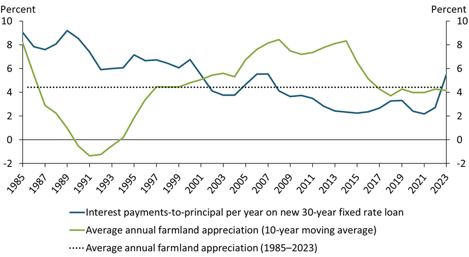
Sources: USDA, Federal Reserve Bank of Kansas City, and author’s calculations.
In 2023, interest costs on new farmland loans (blue line) surpassed the recent average annual appreciation in land values (green line) for the first time since 2001. From 2002 to 2022, growth in agricultural real estate values was well above the cost of financing, supporting demand for farmland. With interest costs now above average land value appreciation, farm operating profits will determine the magnitude of returns for financed land. Although growth in farmland values held firm in 2023, higher interest rates and a moderation in agricultural commodity prices have cut potential returns and could dampen demand for farmland—and thus farmland values—going forward.
Ag Credit Survey
The Kansas City Fed's quarterly Survey of Agricultural Credit Conditions provides current indicators of the financial...
Declining Mergers and Acquisitions Activity Could Portend Lower Investment
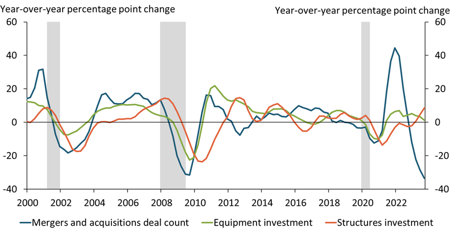
Notes: Gray bars denote National Bureau of Economic Research (NBER)-defined recessions at a quarterly frequency. All values taken as a year-over-year percentage point change for the four-quarter rolling average.
Sources: Bloomberg, U.S. Bureau of Economic Analysis (Haver Analytics), NBER (Haver Analytics), and authors’ calculations.
Higher interest rates and tighter financial conditions tend to slow firms’ growth and reduce mergers and acquisitions (M&A) activity. M&A deal activity (blue line) complements business fixed investments and tends to lead changes in spending on equipment (green line) and structures (orange line). The sharp decline in M&A deals in late 2022 and throughout 2023 may be a reversal of the sharp rise in M&A activity in the second half of 2021 but could also portend a decline in capital investment in the coming quarters. To learn more, see Rodziewicz and Sly (2019).
Capital Reallocation and Capital Investment
David Rodziewicz and Nicholas Sly
Rising merger and acquisition activity complements investment growth by allowing firms to build their productive capacity.
Sales Listings of Existing Single-Family Homes Have Stabilized
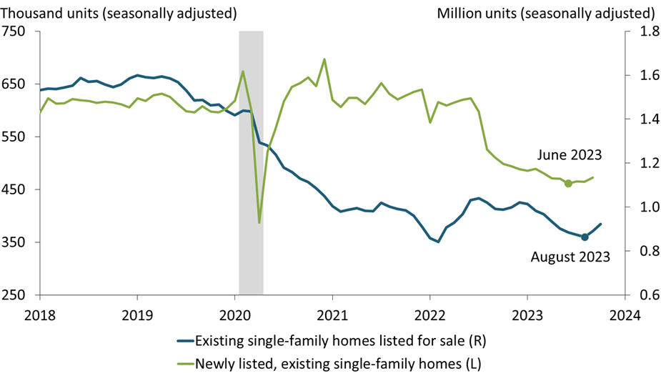
Notes: Gray shading depicts National Bureau of Economic Research (NBER)-defined recession. Newly listed data extend through September 2023; existing listings data extend through October 2023.
Sources: National Association of Realtors, Redfin, and NBER. All data sources accessed via Haver Analytics.
The number of homeowners newly listing their home for sale has inched up since June, following its sharp move downward during the previous two years (green line). Similarly, the number of existing single-family homes listed for sale, both newly listed and previously listed, has moved up since August (blue line), following 18 months of steady decline. This stabilization of both newly listed and total listings of single-family homes suggests that sales of existing single-family homes, which continue to plunge, may also stabilize soon.
Charting the Economy Housing Data and Trends MacroeconomicsSingle-Family Home Permits Continue to Climb despite Faltering Builder Sentiment
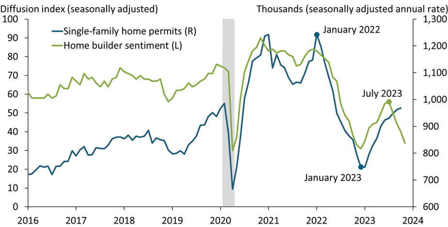
Notes: Gray shading depicts National Bureau of Economic Research (NBER)-defined recession. Permits data extend through October 2023; sentiment data extend through November 2023.
Sources: U.S. Census Bureau, National Association of Home Builders, and NBER. All data sources accessed via Haver Analytics.
The number of single-family permits increased for the ninth consecutive month in October (blue line), leaving its three-month growth rate at 17.4 percent. In contrast, home builders’ sentiment has declined sharply in recent months, with the diffusion index in November falling well into the contractionary range (green line). Builder’s negative sentiment is surprising. Homeowners are gripping their low-rate mortgages, pushing sales listings to near their historic low and sales prices to a historic high. This lock-in effect is likely to persist for some time, suggesting that home construction will remain robust rather than reversing to follow sentiment downward.
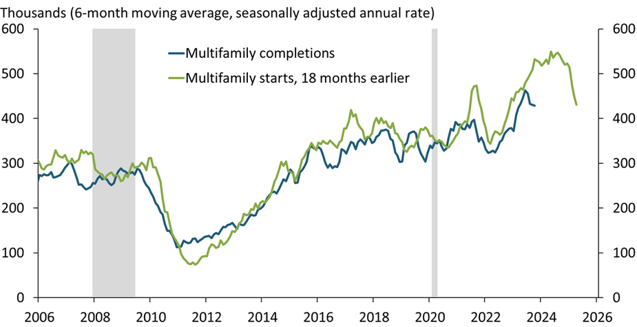
Charting the Economy Housing Data and Trends MacroeconomicsApartment Completions Will Continue to Surge over the Next Six Months
Notes: Gray shading depicts National Bureau of Economic Research (NBER)-defined recession. Data series extend through October 2023.
Sources: U.S. Census Bureau, NBER, and author’s calculations. All data sources accessed via Haver Analytics.
Builders have been completing multifamily units during 2023 at the highest rate since the mid-1980s (blue line). The time to build multifamily units has recently been averaging about 18 months, making the rate of construction starts 18 months earlier (green line) a good predictor of completions. Based on this lag, completions are likely to surge further through at least the first half of 2024. With the deluge of new apartments going on the market, multifamily vacancies have already rebounded a percentage point above their pre-pandemic rate and are likely to continue to move up, putting downward pressure on rent inflation.
Charting the Economy Housing InflationMonetary Policy Takes a Long Time to Cool Labor Markets
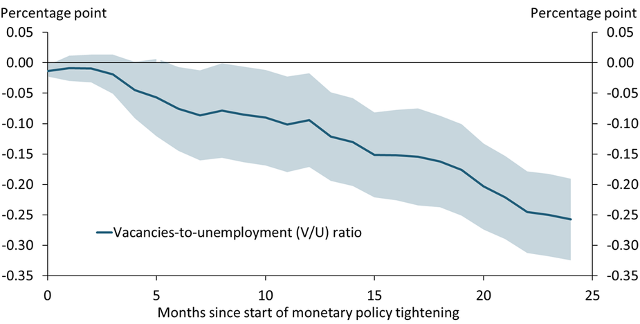
Notes: The chart shows the cumulative effect of a surprise hike in the federal funds rate, coded as a binary variable from Romer and Romer (External Link2023), on the job vacancies-to-unemployment ratio. Monetary policy surprises are narratively identified based on historical minutes and transcripts of Federal Reserve policy meetings. Shaded areas represent one-standard-error confidence bands.
Sources: U.S. Bureau of Labor Statistics (Haver Analytics), Romer and Romer (External Link2023), Barnichon (External Link2010), and author’s calculations.
Historic evidence since 1951 suggests that labor markets respond only slowly to tighter monetary policy. After a surprise hike in the federal funds rate, the vacancies-to-unemployment (V/U) ratio, a popular measure of labor market tightness, declines by an estimated 0.26 percentage points over 24 months. This slow cooling of the labor market is in line with the current tightening cycle. Since the Federal Reserve started raising the policy rate in March 2022, the V/U ratio has only declined from about 1.9 to 1.5 so far and is still well above the pre-pandemic average of about 0.8.
Charting the Economy Labor and Demographics Monetary PolicyWork Stoppages Have an Uncertain Effect on Prices
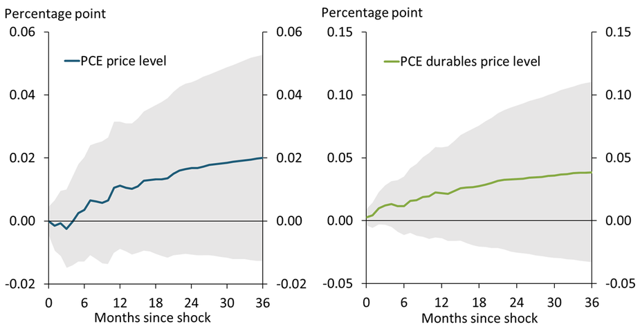
Notes: Chart shows the response of the PCE and PCE durables price indices in the 36 months following a shock to the fraction of idled workers due to work stoppages. The shock is of a magnitude reflecting 25,000 UAW workers striking during September 2023, and reflects an increase in the fraction of worker-days idled due to work stoppages beyond what would be predicted by the last 12 months of inflation, wage growth, industrial production growth, and worker-days idled due to work stoppages.
Sources: U.S. Bureau of Labor Statistics and U.S. Bureau of Economic Analysis.
When work stoppages increase the share of worker-days idled, prices go up slightly on average, especially on durable goods. A shock of the magnitude of the United Auto Workers (UAW) strike that began in September 2023 is predicted to increase the Personal Consumption Expenditures (PCE) price index by 0.02 percentage points (blue line) and the PCE price index for durables by 0.04 percentage points (green line) over the next three years. However, these estimates involve an enormous amount of uncertainty, and because the 95 percent confidence intervals (gray shading) always include zero, we cannot rule out a null effect of a strike of this size on prices.
Charting the Economy Labor and Demographics Macroeconomics ManufacturingMonthly Mortgage Payments for Homebuyers Continue to Soar
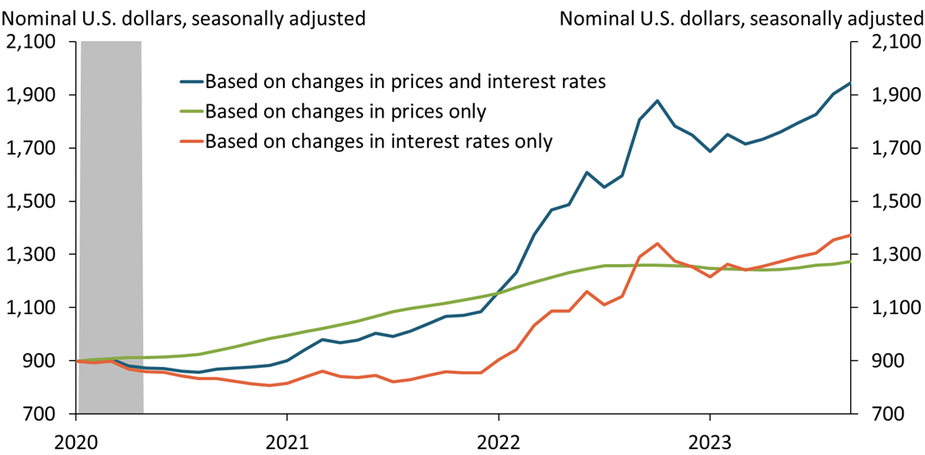
Notes: Chart plots the monthly payment to purchase a home that sold for $250,000 in January 2020, based on a 20 percent down payment and excluding monthly escrow payments, which are used to pay property taxes and homeowner’s insurance. Calculations extend through September 2023. Gray shading depicts National Bureau of Economic Research (NBER)-defined recession.
Sources: Zillow, Freddie Mac, NBER, and author’s calculations. All data sources accessed through Haver Analytics.
Rising home prices and interest rates since January 2020 have more than doubled the monthly mortgage payment required to purchase a home (blue line). In 2020–21, the increase exclusively reflected rising prices (green line). Since then, the increase has primarily reflected rising interest rates (orange line). On their own, rising interest rates have increased monthly payments by more than 60 percent since late 2021, illustrating the strong incentive for owners to remain in their current home rather than sell and purchase a different home at a similar price.
Charting the Economy Data and Trends Housing MacroeconomicsRecent Labor Force Participation Gains for Women with Young Children May Slow as Childcare Stabilization Funds Expire
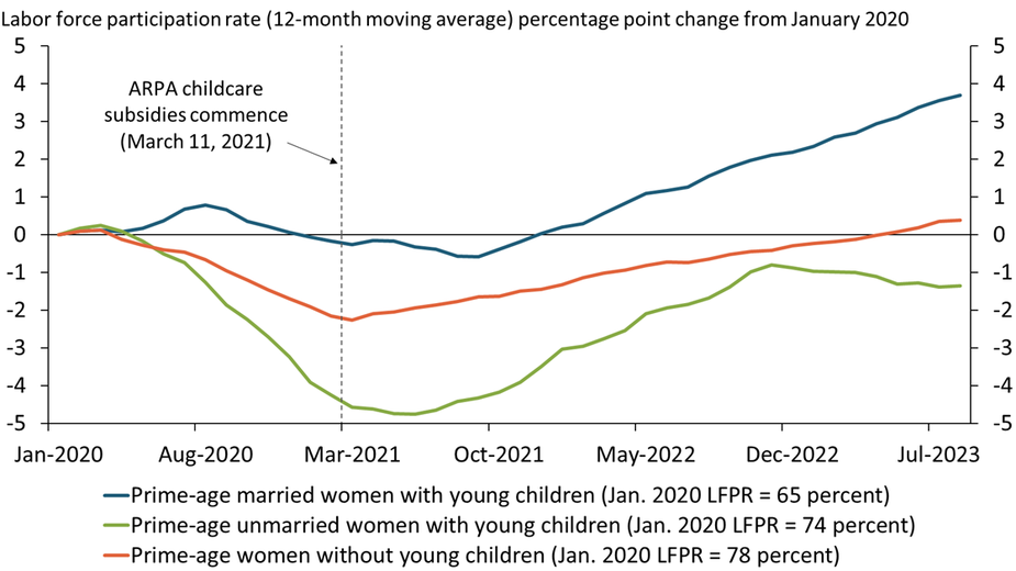
Notes: Chart plots population-weighted percentage point change in 12-month moving average labor force participation rate for each group in a given month relative to January 2020. ARPA is the American Rescue Plan Act. “Prime-age” refers to individuals age 25–54. “Young children” are children under six years old. “Married” corresponds to a married woman with a spouse present.
Sources: U.S. Census Bureau and authors’ calculations.
Labor force participation rates of women with young children (under six years old) have increased significantly since their lows during the pandemic. This rise may be partly attributed to the American Rescue Plan Act’s (ARPA) childcare stabilization funds, which offered financial assistance to daycare providers to remain operational. Childcare availability likely helped the recovery in the labor force participation rate of unmarried women with young children (green line) and supported further increases in the participation rate of married women with young children (blue line). The expiration of these funds on September 30 may limit further progress or cause a partial reversal of these gains.
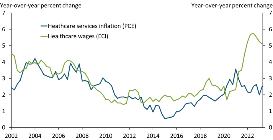
Charting the Economy Labor and DemographicsRising Labor Costs in the Healthcare Sector Are Poised to Buttress Services Inflation
Note: PCE (Personal Consumption Expenditures Price Index) is a measure of price changes; ECI (Employment Compensation Index) is a measure of changes in employee compensation and includes employee benefits.
Sources: U.S. Bureau of Economic Analysis (BEA) and U.S. Bureau of Labor Statistics (BLS).
Historically, inflation in the healthcare sector (blue line) has been tightly linked to wage growth for healthcare workers (green line). This relationship is not surprising as healthcare is labor intensive; according to the BEA, labor accounts for more than 80 percent of output in the healthcare sector. In recent years, however, PCE healthcare services inflation has been surprisingly subdued despite significant wage pressures. Nevertheless, as higher wages have tightened margins for healthcare service providers, PCE inflation for healthcare services is likely to increase.
Charting the Economy Data and Trends Inflation MacroeconomicsSharp Gains in Drilling Productivity over the Previous Decade Have Supported U.S. Oil and Gas Production
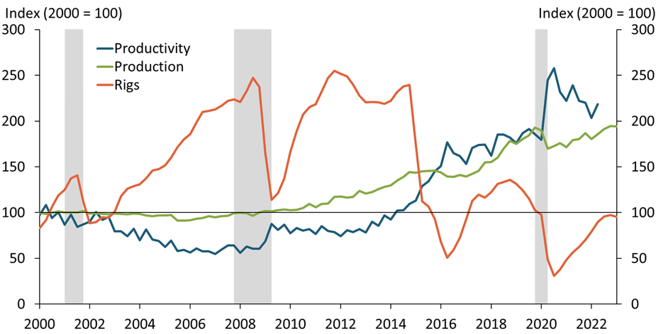
Notes: Productivity is measured as the number of barrels produced per foot of drilling. Production is measured in barrels of oil equivalent—a unit based on the approximate energy released by burning one barrel of crude oil and a way of combining both oil and gas production into a single measure. In recent years, oil and gas production has largely been driven by additional natural gas production. Gray bars denote National Bureau of Economic Research (NBER)-defined recessions.
Sources: Baker Hughes (Haver Analytics), Energy Information Administration, Enverus, NBER, and authors’ calculations.
U.S. oil and gas production has risen steadily over the past decade due in large part to increased drilling productivity. Typically, increases in production are thought to come from a higher number of active drilling rigs. However, for much of the past decade, the number of rigs (orange line) has remained below its 2000 level. Instead, the increase in production (green line) has been driven largely by improved drilling productivity (blue line). The number of barrels of oil produced per foot of drilling has more than doubled since 2014. To learn more, read our Economic Bulletin (linked below).
Drilling Productivity in the United States: What Lies Beneath
Jason P. Brown, David Rodziewicz and Colton Tousey
We construct new measures of drilling productivity and find that productivity increased sixfold from the mid-2000s to early 2017.
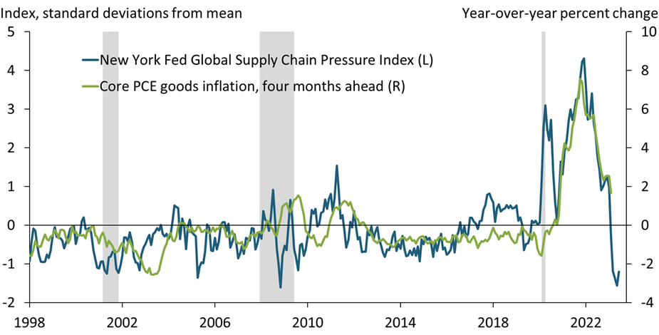
Improvements in Supply Chains Earlier This Year May Lead to Further Declines in Core Goods Inflation in Coming Months
Note: Shaded areas denote National Bureau of Economic Research (NBER)-defined recessions.
Sources: U.S. Bureau of Economic Analysis, Federal Reserve Bank of New York, NBER, and authors’ calculations. All data sources accessed through Haver Analytics.
Supply chain disruptions, as measured by the Global Supply Chain Pressure Index (GSCPI), increased dramatically during the pandemic, reaching unprecedented levels (blue line). These supply shortages led to significant pressure on prices for goods, with core goods prices rising more than 7.5 percent from February 2021 to February 2022. However, since the start of 2022, supply chains have been improving steadily, helping cool core goods inflation (green line). Because core goods inflation has been following the GSCPI with a lag of several months, the most recent declines in the GSCPI suggest potential further declines in goods inflation in coming months.
Charting the Economy Inflation Covid-19 Research MacroeconomicsNewly Unemployed Workers Are Facing More Difficulty Finding Jobs
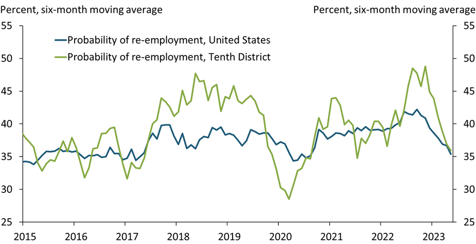
Notes: Values correspond to the fraction of workers unemployed less than five weeks who obtained a job in a given month. The Tenth Federal Reserve District includes Colorado, Kansas, Missouri, Nebraska, New Mexico, Oklahoma, and Wyoming. Tenth District data are not seasonally adjusted.
Sources: U.S. Census Bureau, U.S. Bureau of Labor Statistics (Haver Analytics), and authors’ calculations.
The probability of re-employment for workers unemployed less than five weeks has declined over the past few months, an early signal of the tight labor market loosening. Abundant job openings and strong labor demand in early 2022 made re-employment much easier for job seekers. However, since late 2022, workers who lost their jobs are facing more difficulty finding new employment opportunities in the Tenth Federal Reserve District and across the United States.
Charting the Economy Labor and Demographics RegionalHigher Interest Rates Reduce Headline Inflation ahead of Core Inflation
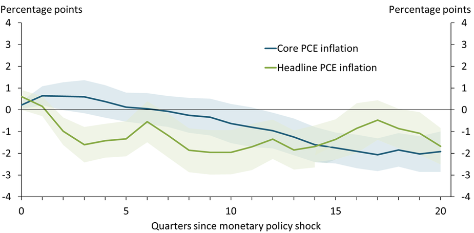
Notes: The chart shows the cumulative effect of a surprise hike in the federal funds rate, coded as a binary variable from Romer and Romer (2023), on the time path of each variable relative to the time path without a surprise hike. Monetary policy surprises are narratively identified based on historical minutes and transcripts of Federal Reserve policymaking meetings. Shaded areas represent one standard error confidence bands.
Sources: Federal Reserve Bank of Kansas City (Haver Analytics), External LinkRomer and Romer (2023), and author’s calculations.
Historic evidence since 1960 suggests that headline inflation responds to monetary policy differently from core inflation, which excludes food and energy prices. After a surprise hike in the federal funds rate, headline personal consumption expenditure (PCE) inflation declines within a year (green line), largely reflecting declines in energy and food price inflation. In contrast, core PCE inflation (blue line) takes two years to decline. The current inflation cycle follows this pattern: over the last year, core PCE inflation declined only slightly, but headline PCE inflation declined from 7.0 to 4.4 percent.
Charting the Economy Inflation Monetary PolicyHigh Prices Continue to Drive Consumer Pessimism about Goods Purchases while Concerns about Interest Rates Grow
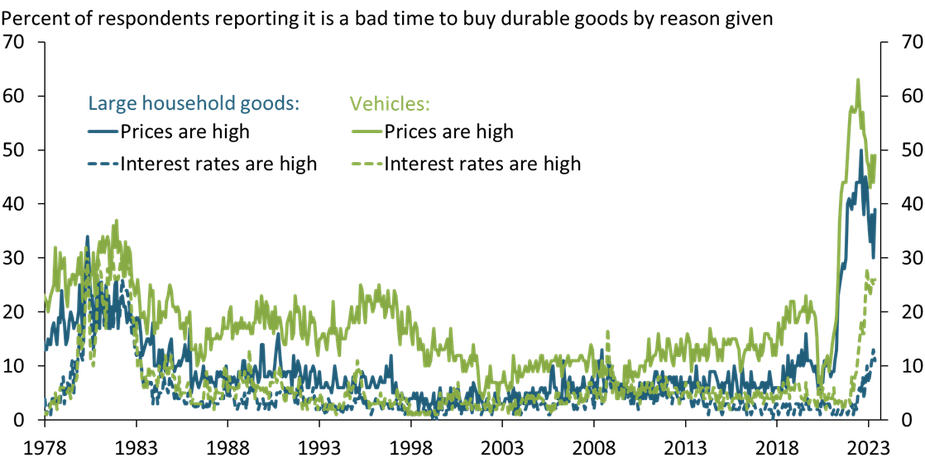
Source: University of Michigan (Haver Analytics).
A historically high proportion of people believe it is a bad time to buy large household goods or vehicles. While concerns about high interest rates have become a major reason given for negative sentiment about these purchases (dashed lines), consumers still cite high prices as the top reason they believe it is a bad time to buy durable goods (solid lines). This negative sentiment is especially striking given that actual goods consumption has been surprisingly resilient. Consumers’ discontent with high prices may weigh more heavily on consumption as excess savings decline and consumer budgets tighten (Çakır Melek and Pollard 2022).
Negative Sentiment toward Spending and Declining Real Incomes May Meaningfully Lower Consumption
Nida Çakır Melek and Emily Pollard
We examine a set of factors that have historically affected consumption growth and find that excess savings have boosted...
The Fed’s Footprint in U.S. Money Market Funds Has Grown Significantly Since 2021
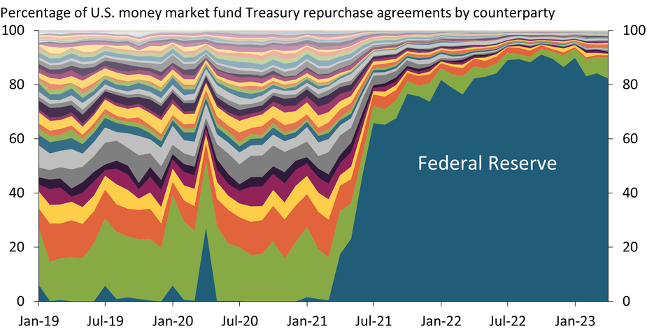
Sources: U.S. Securities and Exchange Commission (via U.S. Office of Financial Research) and author’s calculations.
The Federal Reserve’s Overnight Reverse Repurchase Facility provides money market funds with a short-term, risk-free investment paying competitive returns. Through this program, the Fed’s role as a counterparty for money market funds’ Treasury security repurchases has grown significantly. The chart above shows counterparties to U.S. money market funds in Treasury security repurchase agreements as a percentage of the total market. From 2019 to 2021, activity was spread among a diverse set of counterparties. However, since 2021, the Fed has been the dominant counterparty for U.S. money market funds’ Treasury repurchases.
Charting the Economy Banking and FinancePrices Charged by Publicly Traded Firms Grew Less Than Their Costs in 2022, Even Though Inflation Remained High
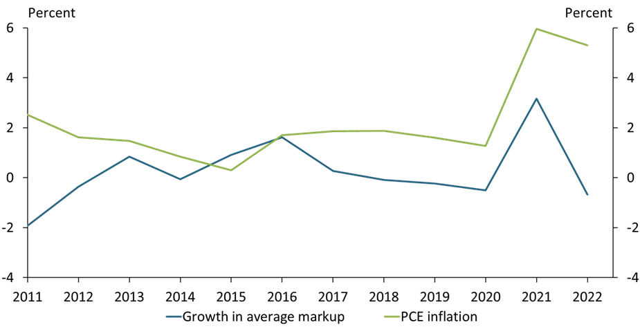
Sources: U.S. Bureau of Economic Analysis (Federal Reserve Bank of St. Louis FRED), Compustat, and authors’ calculations.
Growth in the average markup of publicly traded firms (that is, the price firms charge above their costs) fell sharply from 3.2 percent in 2021 to −0.7 percent in 2022. This decline could have substantially reduced inflation if firms’ costs had remained constant, since inflation is the sum of markup growth plus growth in the marginal cost of production. However, the pace of inflation—as measured by the price index for personal consumption expenditures (PCE)—fell by only 0.7 percentage points, suggesting rapid cost growth drove inflation in 2022.
Charting the Economy Macroeconomics InflationMany Money Market Funds Have Invested Heavily in the Fed’s Overnight Reverse Repurchase Facility

Note: Chart shows ON RRP take-up by participating money market funds in April 2023. Total ON RRP investments are currently limited to $160 billion per fund.
Sources: U.S. Securities and Exchange Commission and authors’ calculations.
The Federal Reserve’s Overnight Reverse Repurchase Facility (ON RRP) has become increasingly important to the business model of many eligible money market funds because it provides a safe investment with competitive returns. The chart above shows each participating money market fund’s ON RRP investment compared with their total investments. Dots close to the 45° line indicate funds with nearly all of their investments in the ON RRP. As of April 2023, many funds kept most, and sometimes nearly all, of their investments in the ON RRP.
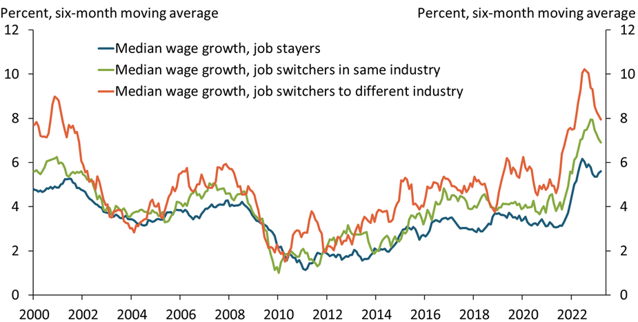
Charting the Economy Banking and FinanceWage Growth Is Softening for Job Switchers, but Remains Steady for Stayers
Sources: Federal Reserve Bank of Atlanta and author’s calculations.
Starting in mid-2021, median wage growth accelerated across job mobility categories in the same order as in prior expansions: first for job and industry switchers (orange line), then for job switchers who remained in the same industry (green line), and finally for stayers (blue line). More recently, wage growth of switchers—particularly those who also switched industries—has been the first category to decline, again consistent with historical patterns. Thus, an overall moderation in wage growth may take some time, as wage growth for the bulk of the employed, job stayers, is generally the last to react.
Charting the Economy Labor and DemographicsHome Prices Remain Near Their Peak, Boosting Single-Family Construction
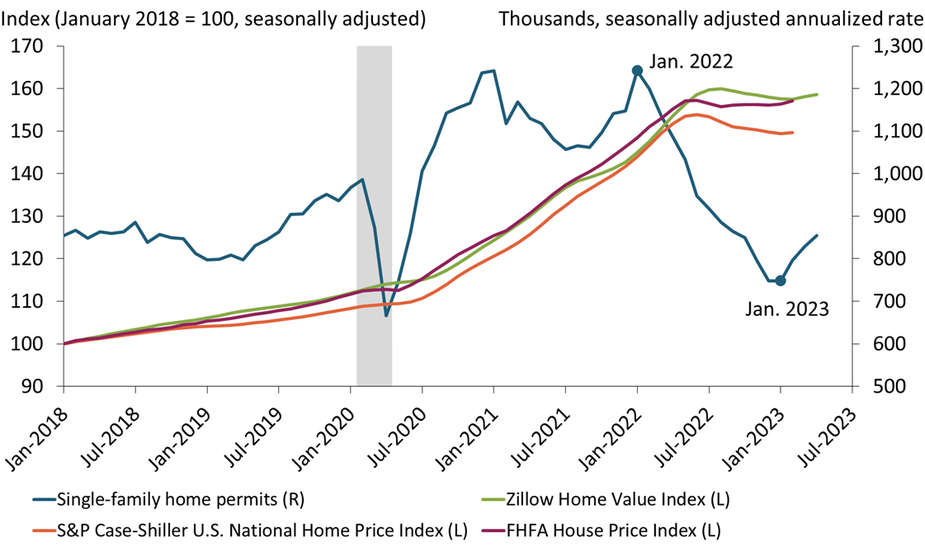
Note: Count of permits and Zillow Home Value index are through April 2023; S&P Case-Shiller and FHFA indexes are through February 2023.
Sources: U.S. Census Bureau, Standard & Poor’s, and Federal Housing Finance Agency (FHFA). All data sources accessed via Haver Analytics.
New permits to construct single-family homes (blue line) climbed for the third straight month in April, increasing 14 percent from their trough in January. This marks a partial reversal from their collapse during 2022 and reflects the surprising resilience of home prices (green, orange, and purple lines). Although the sharp run-up in interest rates has exerted strong downward pressure on prices, this pressure has thus far been offset by current homeowners’ reluctance to sell and give up their low-rate mortgages. As a result, home builders face less competition and so can maintain high profit margins.
Home Prices Are Overvalued but Will Decline Only Gradually
The surge in home prices since the start of the pandemic and the sharp increase in interest rates during 2022 have made...
Sharp Decline in Online Job Postings for Job Recruiters Could Signal a Softening Labor Market
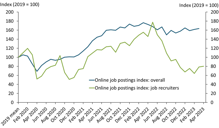
Notes: The mean online job postings for human resource specialist (recruiter) per month in 2019 was 30,848. Overall online job posting data is from the Conference Board’s Help Wanted Online Index (HWOL).
Sources: Lightcast and the Conference Board.
Online job postings have been persistently high compared with pre-pandemic levels (blue line), reflecting heightened labor demand. In contrast, after peaking in 2022, online postings for job recruiters have fallen sharply over the past year and are 20 percent below 2019 levels as of April 2023 (green line). The decline in recruiter postings may suggest that fewer employers are interested in recruiting new workers or that hiring new workers has become easier. Because having fewer recruiters may lead to fewer job openings in the coming months, this decline could signal that the labor market is softening.
Charting the Economy Labor and DemographicsThe LMCI-Implied Unemployment Rate Suggests Actual Unemployment May Begin to Rise
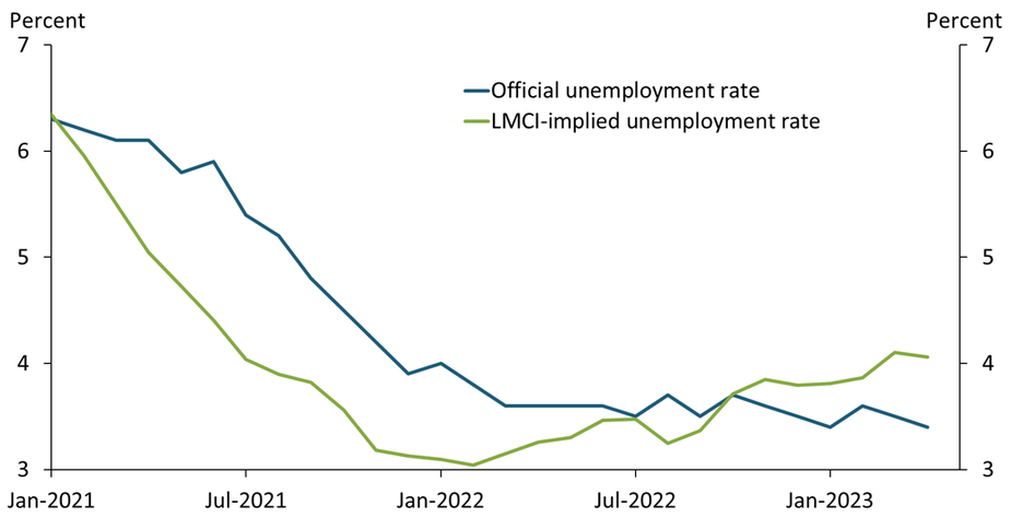
Sources: U.S. Bureau of Labor Statistics; Federal Reserve Bank of Kansas City; Glover, Mustre-del-Río, and Pollard (2021); and authors’ calculations.
Despite some signals of labor market slackening, the unemployment rate (blue line) has shown little upward movement over the past several months. However, the Kansas City Fed’s Labor Market Conditions Indicators (LMCI) unemployment rate (green line) suggests some loosening has begun. This alternative measure of the unemployment rate (updated from Glover, Mustre-del-Río, and Pollard 2021) began rising early in 2022 and now stands at 4.1 percent. Historically, turning points in this alternative measure have preceded turning points in the official measure, suggesting actual unemployment may begin to rise.
Kansas City Fed’s Labor Market Conditions Indicators
The Kansas City Fed Labor Market Conditions Indicators (LMCI) are two monthly measures of labor market conditions based on 24...